Milkcrate - Music Player App
OVERVIEW
Milkcrate is a music player app catering to users who listen to electronic style music. The app allows for a visualizer display and various audio presets. This was created as part of an Adobe XD Daily Challenge.
PLATFORM
Mobile iOS
TOOLS
Illustrator, Adobe XD
SCOPE
1 week
ROLE
UI Designer
Mood Board

It was important to get a sense of what has been established before in the music player app space. When I decided to choose electronic music, I looked at the some of albums, logos, and equipment associated with the sub-genres within electronic music.
Colour Palette

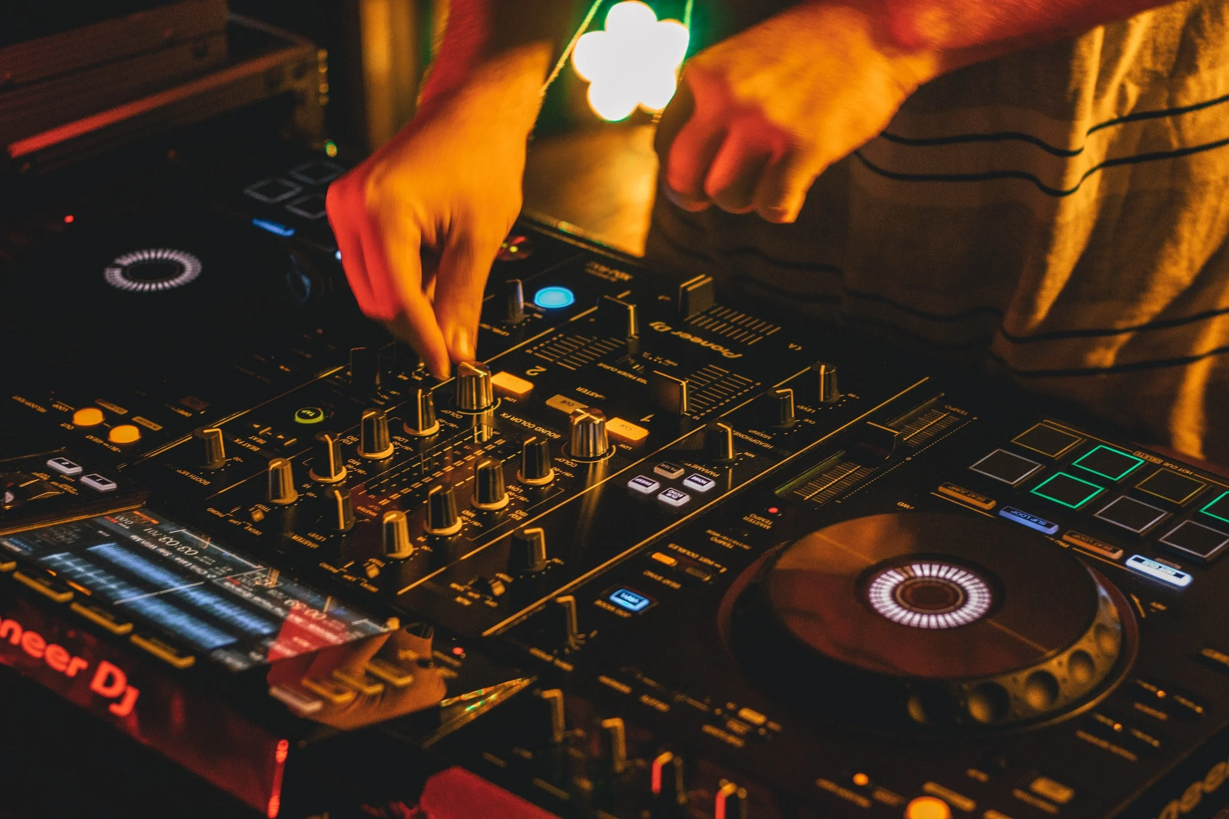
While dark colours are predominant in the genre of electronic music, I wanted to contrast it with some bright colours similarly found on DJ equipment. To give a feel that the user was mixing and performing their music. I was also inspired by the early MP3 craze of visualizers used by apps like WinAMP. Looking at equalizers gave me the reds and greens to balance off the dark greys and blacks on turntable decks, synthesizers, and drum machines.
Typography

For main headlines and titles, I opted to go with Republica Minor. While conducting initial research of certain electronic artists, they tended to opt for very stylistic and abstract fonts. I wanted to keep things legible on the mobile device, with a thick font that flowed well when reading. For the body copy text, Avant-Garde BK was chosen. A slim font was a good contrast in style and is widely popular with the modern EDM crowd.
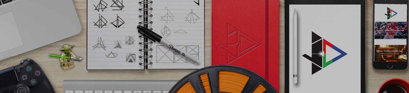
Icons / Bars / Buttons / Logo
Using an existing Adobe XD UI Kit and referring to the Apple iOS Design System, I crafted these icons for usage. Specific colour combinations worked better than others but also required the use of Avante Garde Bk at a specific point size for legibility. Old milk jug crates inspired the logo. At the height of popularity with vinyl records, DJs would be ‘diggin’ thru the crates’ looking for records to sample beats and rhythms for new songs.
User Flow
For the music player, I mapped out a general flow of how users would discover new artists, custom playlists, create and share their own curated playlists, and access their library of music. One of the added features would be purchasing additional visualizers within the music player. While it is mentioned, the mapping of doing the in-app purchase is something I’ll look into in the future.

Low Fidelity Wireframes


The splash screen would serve as an introduction to the mobile app telling the user the music player focuses on the electronic music scene. Home screen would serve as the new recommendations of artists and playlists called “Recommended Crates”. Skins are top recommended downloadable visualizers available for purchase. Ideally, a mini-storefront would be crafted, without the need from leaving the music player app to the App Store.
High Fidelity Wireframes


When designing the “Now Playing” section, the emphasis on the play icon on the top bar would be emitting a pulsating volume animation. The screen would drop down showing the current track. In the corner would be the favourite icon stating this song was in your library of tracks. The star would be a rating for a song and how popular it was within the electronic music community. Below the audio controls, I added the “visualizer” icon. When pressed the Now Playing screen would shift to a full-screen display of the visualizer.